+9
Released
New logos on the home page slow me down
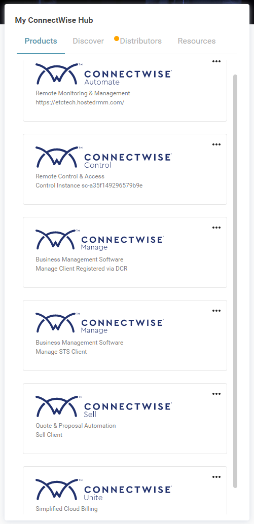
The new home page logos slow me down. Please bring back the colors and make the actual product name larger, we all know that we are on the ConnectWise home screen "ConnectWise" above "Automate" could either be smaller or removed.
For example, I looked over and clicked on the "Green" icon to open Automate. I didn't need to read the links.

Customer support service by UserEcho


Agree with this! The new logos make it so much hard than it needs to be to get into the right product.
Completely agree...different icons/colors make it very easy to choose the correct portal.
I agree as well.
Hi All,
Considering all the feedback, we have updated the experience with the Products tab on Home.
Thanks,
Rishabh Anand
Product Owner - ConnectWise Home